
Simple Menus That Don’t Confuse People : For Beginners de
Why store navigation matters more than it looks
A lot of small store owners spend time choosing colors, product photos, and homepage sections, then leave the menu for later. The menu ends up being one of the last things built, even though it shapes how people move through the whole store.
That matters because many shoppers do not land on the exact product they want right away. They browse. They compare. They look for a category that sounds familiar. If the navigation feels messy, vague, or overloaded, the store starts feeling harder to use than it should.
For a small online store, better navigation does not mean bigger menus or more dropdowns. It usually means clear labels, fewer choices, and a structure that helps people find the next step without stopping to think too much.
What a simple menu should do first
A store menu has one main job: help people get where they want to go quickly. That sounds obvious, but a lot of menus fail because they try to sound clever instead of useful.
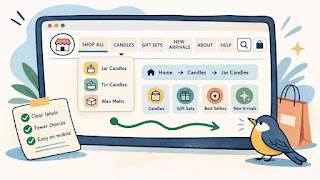
The best navigation labels are usually plain. “New Arrivals,” “Shop All,” “Best Sellers,” “Skin Care,” or “Gifts” are easy to understand. A label like “Curated Finds” or “Daily Essentials” may fit the brand voice, but it can slow people down if they are not sure what it contains.
A simple menu should help a first-time visitor answer basic questions fast. Where do I browse? Where are the main categories? Where do I find support or contact info? A strong menu does not leave those answers buried.
Most small stores do better with a short top-level menu than a long one. If everything is in the main navigation, nothing feels important.
What should be easy to find
- Main product categories
- A “Shop All” or similar browsing path
- New arrivals or best sellers, if they matter
- Search, if the store has enough products to justify it
- Help pages like FAQ, Contact, or Returns when useful
This does not mean every support page belongs in the top menu. It means the structure should feel logical and easy to follow.
How to organize menus without confusing people
A good way to organize navigation is to think like a new shopper, not like the store owner. You know the catalog too well. A first-time visitor does not.
Start by grouping products the way customers would naturally look for them. That might mean category by product type, use case, collection, or audience. For example, a small home goods shop might organize around Kitchen, Bath, Storage, and Gifts. A skincare store might organize around Cleansers, Moisturizers, Treatments, and Bundles.
What usually works less well is building the menu around internal language. If customers do not already know what “Edit,” “Core,” or “Studio Series” means, those labels create extra work.
Another helpful move is limiting how many top-level choices appear at once. Many small stores can do a lot with four to six main navigation items. That keeps the menu easier to scan, especially on mobile.
Practical steps
- List your real product groups in plain language.
- Cut labels that sound nice but are hard to guess.
- Keep the top-level menu short.
- Put lower-priority links in the footer or secondary menu.
- Check the mobile menu, not just the desktop header.
Dropdowns can help, but only when they simplify the path. If the dropdown becomes a giant wall of links, it stops helping. A shopper should be able to glance at it and understand the choices right away.
One useful test is the pause test. If someone opens the menu and hesitates because they are not sure where to click, the structure probably needs work.
Common navigation mistakes that create friction
One common mistake is adding too many menu items because every page feels important. From the owner’s side, that makes sense. From the shopper’s side, it creates noise.
Another problem is weak category naming. If the labels are too broad, too branded, or too abstract, shoppers have to guess. Guessing creates friction. Friction creates exits.
Menus also become harder to use when desktop and mobile feel very different. If the desktop menu is clear but the mobile menu is buried under layers of dropdowns, the store may still feel frustrating to a large share of visitors.
There is also the issue of mixing shopping and support paths without structure. If “Contact,” “Blog,” “Shop,” “Returns,” “About,” “Bundles,” “Gift Cards,” and six product categories all sit at the same level, the menu starts feeling crowded. A little separation helps. Product browsing links should usually lead, while lower-priority or support links can sit in a footer, utility bar, or help section.
Common mistakes
- Too many top-level menu items
- Vague or brand-heavy labels
- Dropdowns with too many choices
- Important categories hidden inside less useful labels
- Mobile navigation that takes too many taps
- No clear path back to main browsing pages
A simple example: imagine a small candle shop with a menu that says Shop, Collections, Edit, Seasonal, Signature, Journal, Story, and Support. A new shopper may not know whether “Signature” means best sellers, core scents, or something else. A simpler setup like Shop All, Candles, Gift Sets, New Arrivals, About, and Help would usually be easier to use.
That does not make the brand less interesting. It just makes the shopping path easier.
A quick store navigation checklist summary
Quick checklist
- [ ] Top-level menu items are short and clear
- [ ] Product categories use plain language
- [ ] The menu is easy to scan on mobile
- [ ] Shoppers can browse all products without confusion
- [ ] Dropdowns simplify the path instead of expanding it too much
- [ ] Support pages are easy to find, even if not all in the main menu
- [ ] Labels make sense to first-time visitors
- [ ] Important pages are not buried under vague headings
- [ ] The navigation feels consistent across the store
- [ ] The menu helps people move forward without guessing
If the menu misses several of these basics, shoppers will often feel the friction before they can explain it.
Keep the menu clear, then improve from there
A store menu does not need to be clever to work. It needs to be understandable. That is what helps people browse with less effort and trust the store a little faster.
For a small online store, the first best move is often to cut, not add. Remove weak labels. Combine overlapping categories. Put lower-priority links somewhere quieter. Then test the result on your phone and see whether the path feels smoother.
Navigation improvements are easy to overlook because they are not flashy. But they affect almost every visit. A cleaner menu can help product discovery, reduce drop-off, and make the whole store feel more organized.
Gentle next step
Open your current menu and read each label as if you have never seen the store before. If a label makes you pause or guess, rewrite it in plainer language. Then trim anything that does not need to be at the top level. Sin estres. A simpler menu usually helps faster than adding more options ever will.
FAQs
Q1. How many items should a small store have in its main menu?
A1. There is no perfect number, but many small stores do well with around four to six top-level items. Enough to guide browsing, not so many that the menu becomes noisy.
Q2. Should support pages go in the main navigation?
A2. Some should be easy to find, but not every support page needs top billing. A footer, utility menu, or help section can handle lower-priority links cleanly.
Q3. Is it okay to use creative category names?
A3. Sometimes, but clarity should come first. If a first-time shopper cannot guess what the category contains, the label is probably making browsing harder.
Q4. Why does mobile navigation matter so much?
A4. Because a large share of shoppers browse on phones. If the menu takes too many taps or hides important paths, the whole store can feel harder to use.

